Skip to content

Concept ads

What a test concept looks like once it is built.

Each of these started as a survey of a category, became a written test concept about what would resonate, and was then produced as an ad. The concept and the evidence sit beside every one, because the reasoning is the part that transfers.

Feed formats

Static, carousel, before and after, comparison, collection and text-led — all at 4:5. The format is part of the concept: a claim that needs two states is not a single image, and a claim about range is not one hero shot.

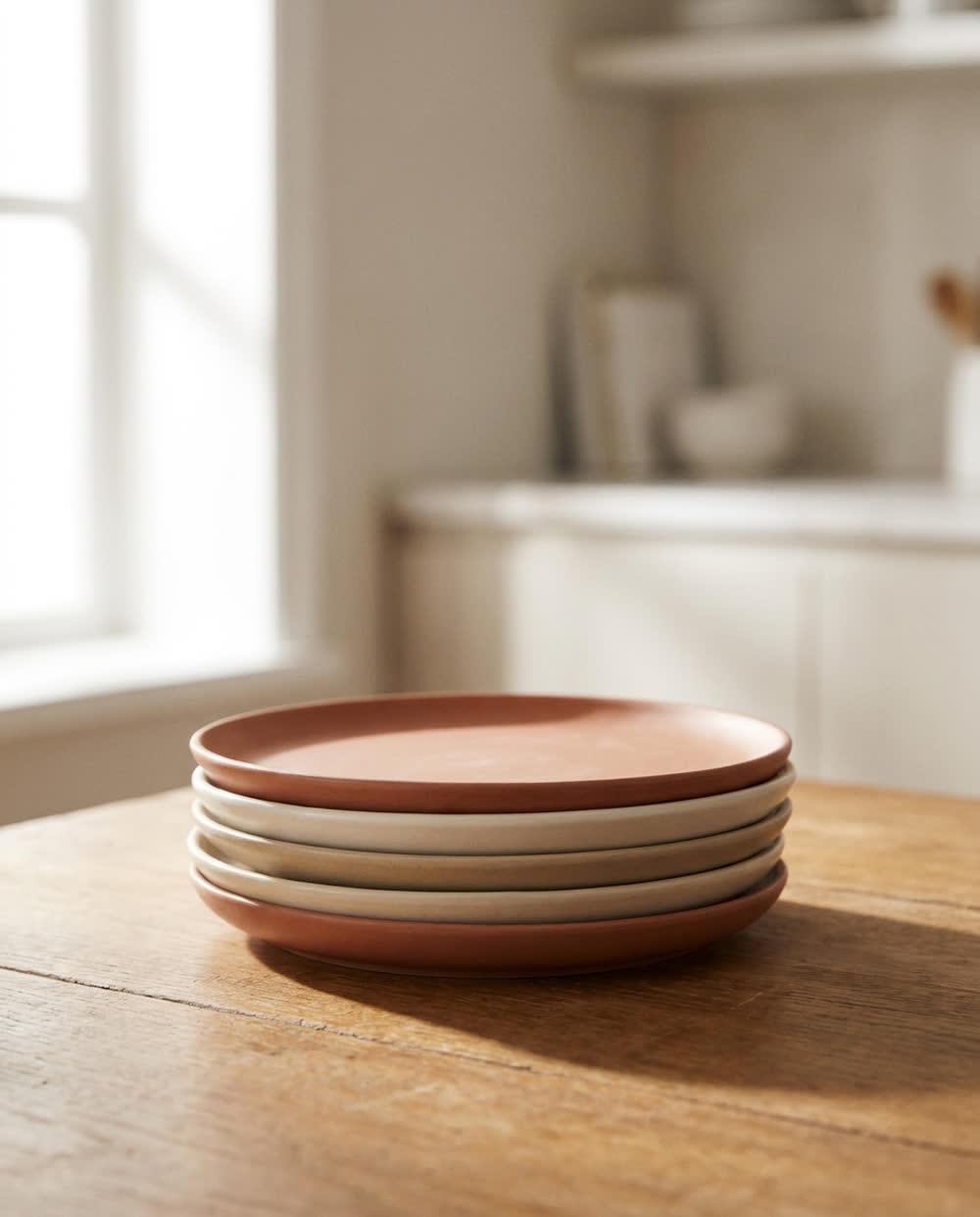
  • A stack of matte ceramic dinner plates on an oak surface in soft morning light.

    The plates survived four house moves.

    Stoneware, not sentiment.

    Harbour & RoweDTC home goodsStatic

    Runs as

    Single image, 4:5 — every platform

    Test concept

    Durability outperforms aesthetics as a lead message in a category where every competitor opens on styling.

    Evidence

    Of the longest-running ads in the category, the ones still live after 90 days led on material and longevity. The newest entrants all led on colourways.


  • A resistance band and folded towel on a dark slate floor under cold directional light.

    Twelve minutes. No floor space. No excuses left.

    The programme for people who already tried the other one.

    Cadence MethodSubscription fitnessStatic

    Runs as

    Single image, 4:5 — every platform

    Test concept

    Naming the objection outperforms naming the outcome for an audience that has already bought and abandoned a competing programme.

    Evidence

    Review-gap analysis on three competitors: the most repeated one-star theme was time, not results. No live ad in the set addressed it.

    Colour — contrasts with the category

    The category advertises in dark, moody, desaturated tones. A volt green at full saturation is the loudest available departure, and matches an ad whose whole argument is impatience. cool · high saturation · light

  • A frosted amber glass bottle standing in shallow water under bright clinical daylight.

    Everything on the label. Nothing behind it.

    Third-party tested, batch by batch.

    Meridian LabsHealth & wellnessStatic

    Runs as

    Single image, 4:5 — every platform

    Test concept

    Transparency as the lead claim, in a category where share of voice is concentrated on outcome promises.

    Evidence

    Directional share of voice from public ad data: the four highest-volume advertisers all led on energy or sleep outcomes. Testing and sourcing appeared in none.

    Colour — contrasts with the category

    Supplement creative runs warm and earthy to signal nature. Cool and desaturated reads clinical instead, which is what a transparency claim needs to be believed. cool · low saturation · light

  • Hands holding a phone with a blank screen in a warm, blurred cafe interior.
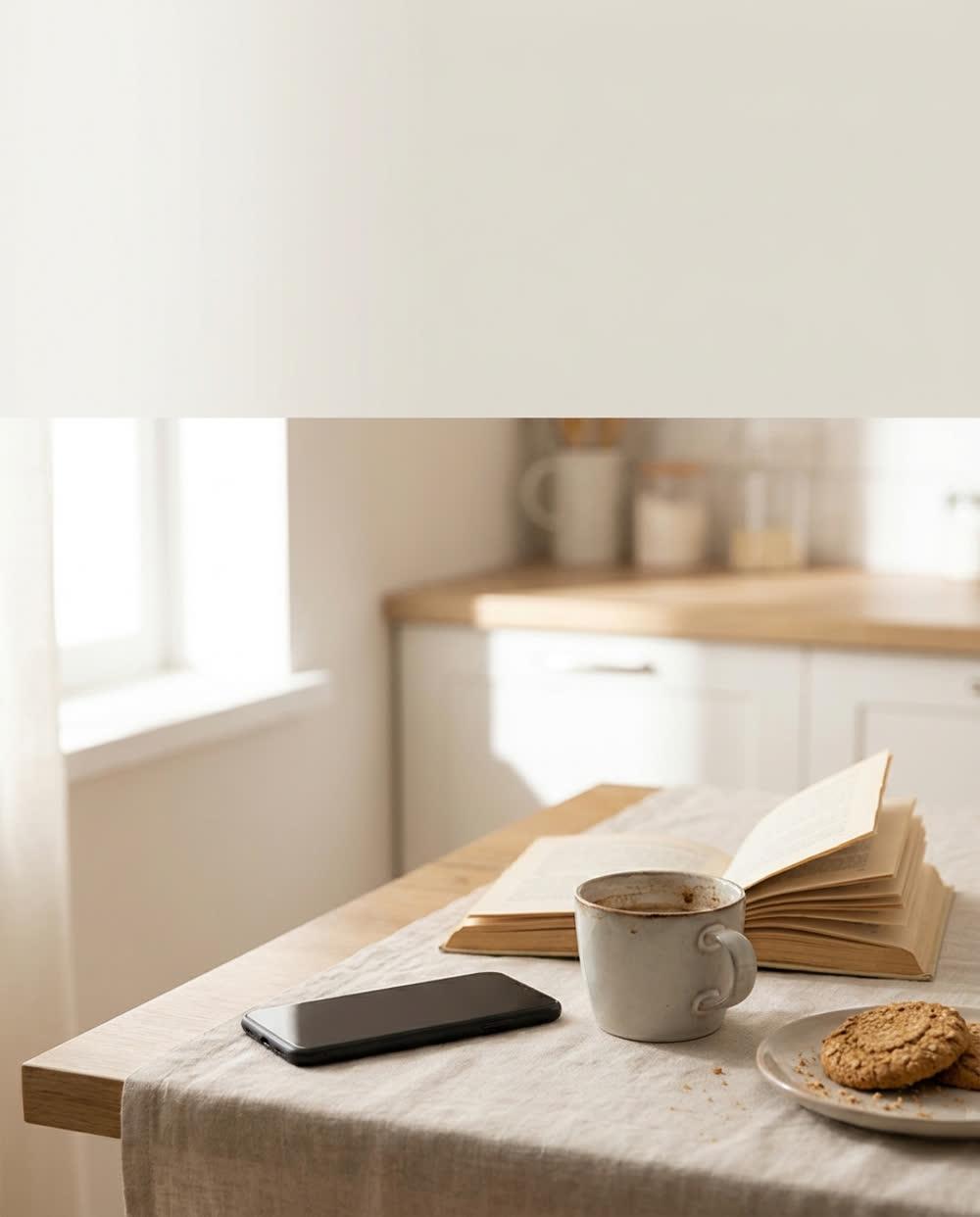
    A phone lying face down on a breakfast table beside a cup of tea and an open book.
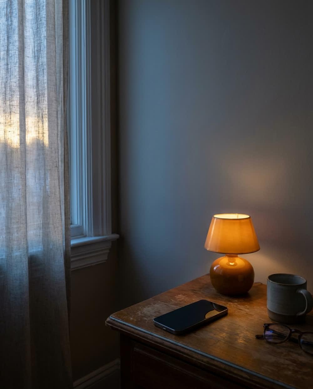
    A phone with a blank screen on a bedside table at dawn, beside a small lamp.

    You do not need another feed.

    One message a day, from people you actually know.

    ThreadConsumer appsCarousel

    Runs as

    Carousel — re-cut to 1:1 for Meta, which renders cards square

    Test concept

    Positioning against the category itself, rather than against a named competitor, for a product whose differentiator is restraint.

    Evidence

    The most-duplicated creative pattern in the category was the feature-grid carousel. Every variant sold more; none sold less.

  • A tan leather weekend bag on a worn concrete step in late afternoon sunlight.

    Buy it once. Then stop thinking about bags.

    Full-grain leather, repaired free for ten years.

    Fenwick SupplySpecialty retailStatic

    Runs as

    Single image, 4:5 — every platform

    Test concept

    The guarantee as the hook rather than a trust badge in the footer, where the category consistently buries it.

    Evidence

    Across the surveyed set, warranty language appeared in landing pages but in almost none of the ad creative. Longest-running ads in adjacent categories led with it.

  • Frosted glass panels and soft gradient light on a deep navy background with a red accent glow.

    Your ops lead has eleven tabs open right now.

    Close ten of them.

    NorthpointB2B SaaSStatic

    Runs as

    Single image, 4:5 — every platform

    Test concept

    A concrete role and a concrete moment, against a category that advertises to job titles in the abstract.

    Evidence

    Messaging whitespace: competitor creative addressed 'teams' and 'organisations'. None named the individual who feels the problem daily.

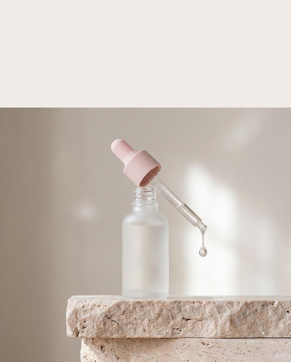
  • A frosted glass dropper bottle on pale stone with a drop of serum caught mid-fall.

    Four ingredients. We can name all of them.

    So can you.

    Lume AtelierSkincareStatic

    Runs as

    Single image, 4:5 — every platform

    Test concept

    Brevity of formulation as the claim, in a category whose advertising competes on quantity of actives.

    Evidence

    Longest-running creative in the surveyed set leaned on single-ingredient stories. Short-lived ads listed five or more actives at once.

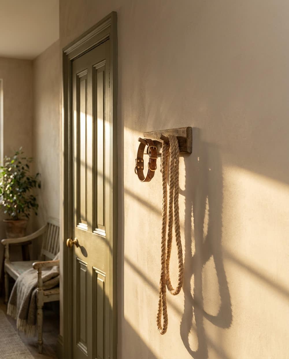
  • A woven dog lead and worn leather collar hanging on a hook in warm late light.

    It will outlast three of their collars.

    Hardware rated for dogs who pull.

    FieldhoundPet suppliesStatic

    Runs as

    Single image, 4:5 — every platform

    Test concept

    Speaking to replacement fatigue rather than to affection, in a category where almost all creative is emotional.

    Evidence

    Review gaps across four competitors clustered on hardware failure. Every live ad in the set led on the bond between owner and dog.

  • A ceramic pour-over cone over a glass carafe on dark walnut, steam rising.
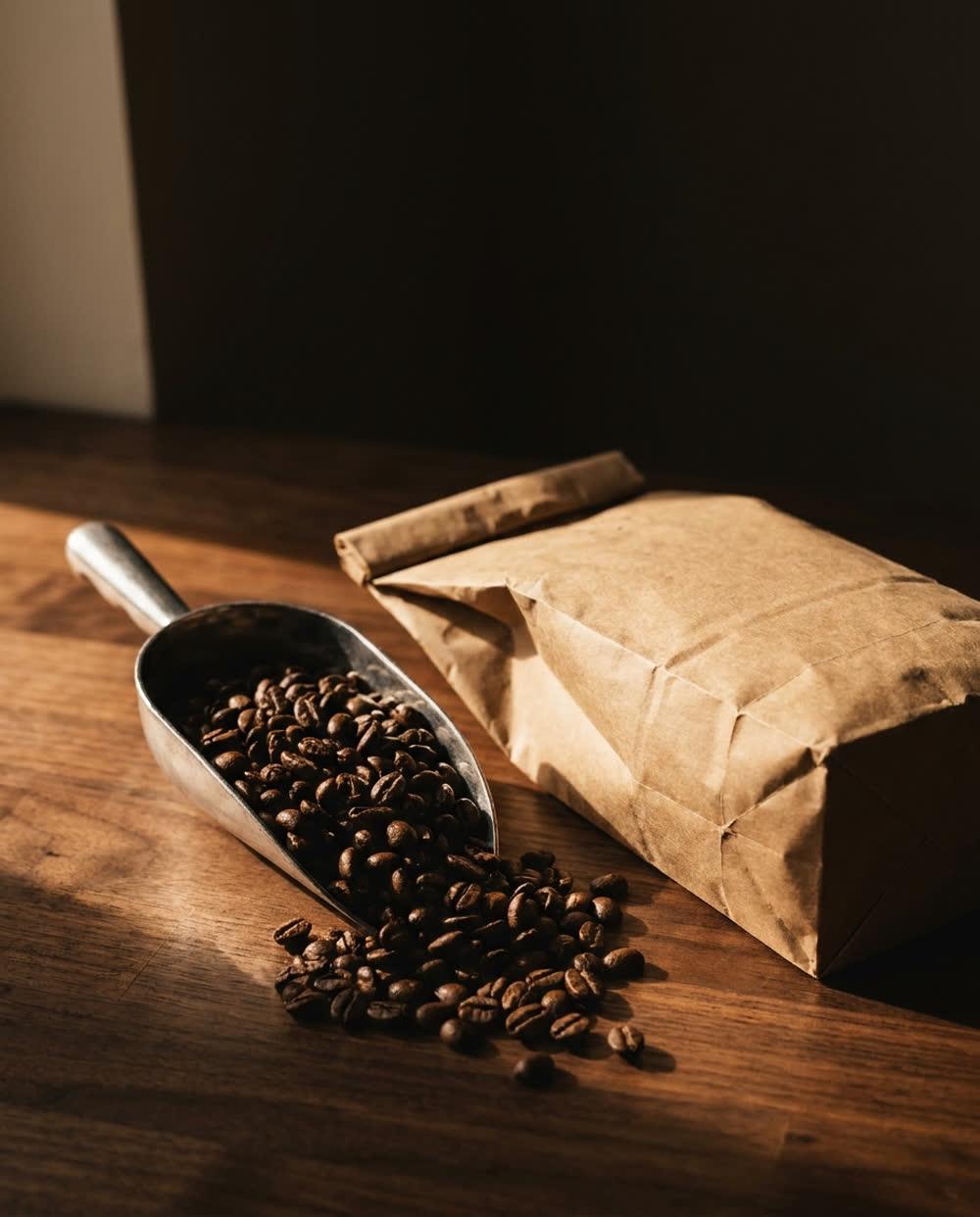
    A scoop of whole dark roast beans spilling onto a walnut counter beside a kraft bag.
    A finished cup of black coffee with crema on the surface, steam rising in sidelight.

    Roasted Tuesday. On your counter Thursday.

    That is the whole pitch.

    Ninth Street RoastersFood & drinkCarousel

    Runs as

    Carousel — re-cut to 1:1 for Meta, which renders cards square

    Test concept

    Freshness expressed as a date rather than an adjective, where the category relies on origin storytelling.

    Evidence

    Origin and tasting notes dominated share of voice. Roast-to-delivery timing appeared in none of the creative surveyed, though it recurs in five-star reviews.

    Colour — conforms with the category

    Deliberately conforming. Warm amber is doing real work in food — it reads as appetite — and the differentiation here is in the message, not the palette. The saturation is set by the photograph rather than by taste: over a frame this bright, 4.5:1 caps this hue at a little over a third saturation, so the warmth stays and the intensity goes. warm · low saturation · light

  • Tortoiseshell acetate spectacles folded on a linen-bound book in crisp window light.

    Try six. Send five back. Pay nothing until you decide.

    The frames are the easy part.

    BellweatherEyewearStatic

    Runs as

    Single image, 4:5 — every platform

    Test concept

    Leading with the friction removed rather than with the product, for a purchase whose main barrier is fit uncertainty.

    Evidence

    Home try-on existed at most competitors but sat below the fold on their sites. It appeared in almost no ad creative in the surveyed set.

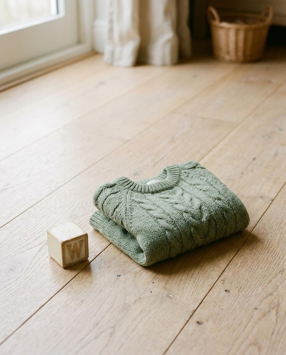
  • A small knitted jumper folded on a pale wooden floor beside a wooden toy block.

    Made to be handed down, not thrown out.

    Reinforced where children actually wear through.

    Pips & CoKids & babyStatic

    Runs as

    Single image, 4:5 — every platform

    Test concept

    Durability framed as inheritance, against a category whose creative is built almost entirely on cuteness.

    Evidence

    Across the surveyed set, no long-running ad mentioned construction. Review gaps clustered on seams and washing.

    Colour — contrasts with the category

    Children's clothing advertises in bright primaries and pastels. A muted sage says heirloom rather than toy, which is what made to be handed down has to feel like. cool · low saturation · light

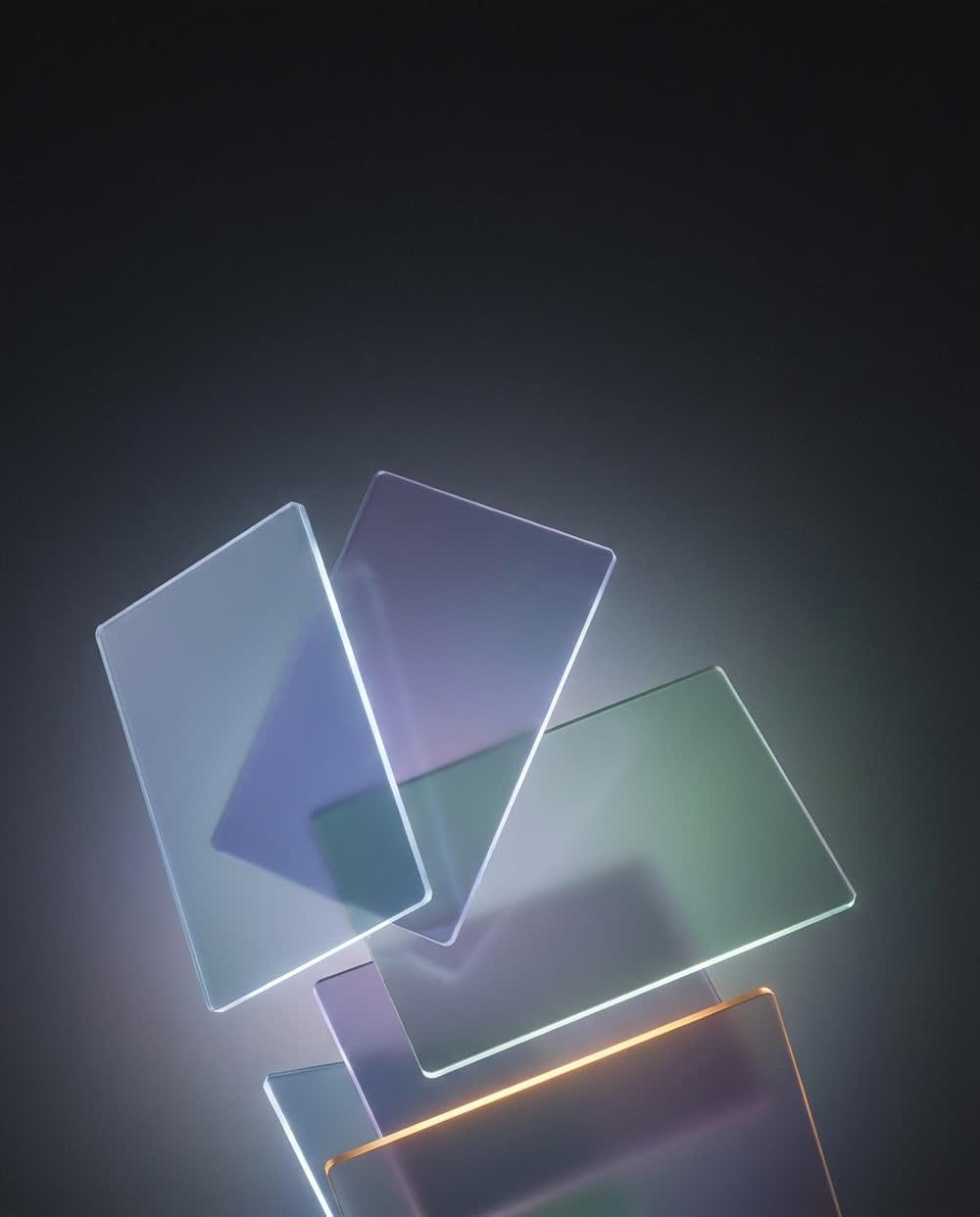
  • Translucent cards floating in soft gradient light on a deep charcoal background.

    It does not tell you to stop buying coffee.

    It tells you what the subscriptions cost you last year.

    TallowFintechStatic

    Runs as

    Single image, 4:5 — every platform

    Test concept

    Rejecting the category's moralising tone, for an audience that has already uninstalled an app that lectured them.

    Evidence

    Review gaps on three budgeting competitors clustered on condescension. No live ad in the set addressed tone at all.

    Colour — contrasts with the category

    Blue is the single most concentrated colour in finance; Labrecque and Milne tie it to competence, which is why everyone uses it. A warm amber reads as non-judgemental, which is the entire positioning against apps that lecture. warm · low saturation · light

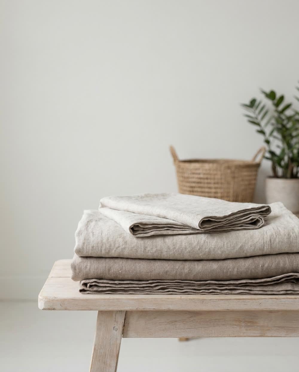
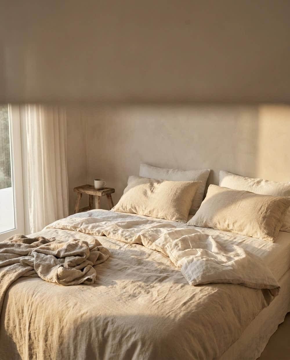
  • A folded stack of washed linen sheets in oatmeal and clay tones on a pale bench.
    An unmade bed with rumpled linen bedding in low raking morning light.
    Extreme macro of washed linen weave showing a seam and a single loose thread.

    It gets better for about forty washes.

    Then it stays there.

    PlyBeddingCarousel

    Runs as

    Carousel — re-cut to 1:1 for Meta, which renders cards square

    Test concept

    Selling the break-in period rather than first-night softness, in a category whose creative promises immediate comfort.

    Evidence

    Review gaps across three competitors clustered on linen feeling stiff on arrival. None of the surveyed creative set an expectation for it.

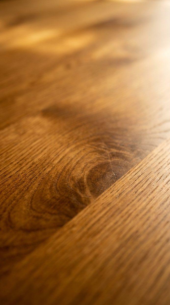
  • Macro of a dry, grey, open-grained oak surface with fine surface cracking.
    Macro of the same oak oiled, the grain deep honey brown with a soft satin sheen.

    Grey is not age. Grey is thirst.

    One coat. Forty minutes. No sanding.

    OakhandFurniture careBefore / after

    Runs as

    Single image, 4:5 — or a two-card carousel

    Test concept

    Reframing the visible problem, in a category whose creative sells the finished look rather than the diagnosis.

    Evidence

    Surveyed furniture-care ads opened on restored surfaces almost without exception. None named the untreated state as a condition with a cause.

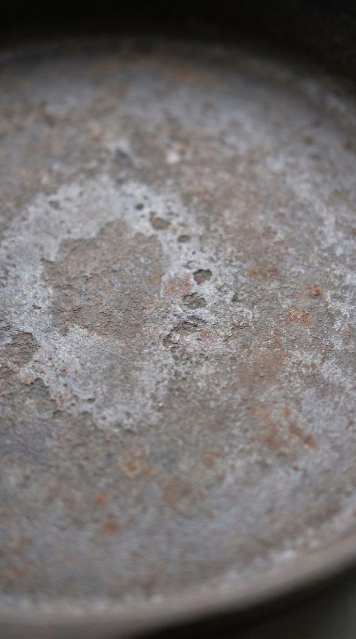
  • Macro of a neglected cast iron pan surface, dull grey-brown with patchy oxidation.
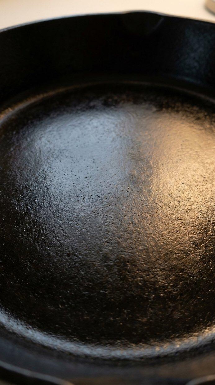
    Macro of the same pan seasoned, the surface deep black with an even satin sheen.

    You did not ruin it. You stopped feeding it.

    Seasoning wax · twenty minutes · one oven

    Foundry NineCookwareBefore / after

    Runs as

    Single image, 4:5 — or a two-card carousel

    Test concept

    Removing blame as the opening move, in a category that sells replacement rather than recovery.

    Evidence

    Across the surveyed set the longest-running cookware ads led on buying the right pan. Care and recovery language appeared almost entirely in organic review copy, not in paid creative.

    Colour — contrasts with the category

    Cookware advertising runs warm and appetising — flame, butter, the finished plate. Cool steel grey at low saturation refuses the food shot and sits with a maintenance claim, which is what this ad is actually selling. cool · low saturation · light

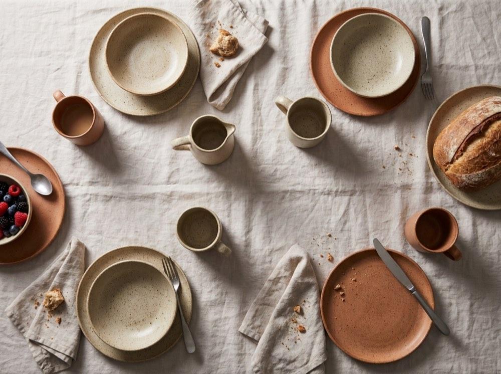
  • Overhead view of a laid table in matte speckled stoneware on pale linen, in morning light.

    Nothing here was made to match.

    It does anyway.

    • A speckled stoneware mug in warm oatmeal.Mug
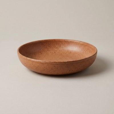
    • A shallow stoneware serving bowl in clay terracotta.Bowl
    • A stoneware pouring jug in chalk white.Jug
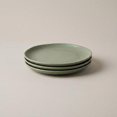
    • A stack of three stoneware side plates in muted sage.Plates
    Marlowe SupplyTabletop & ceramicsCollection

    Runs as

    Meta Collection — needs a connected product catalogue

    Test concept

    Selling the range as the product, in a category whose creative sells one hero piece at a time.

    Evidence

    Single-product creative dominated the surveyed ceramics set. Collection layouts appeared almost exclusively in seasonal retail ads, not in evergreen ones.

    Colour — conforms with the category

    Tabletop sits in muted earth and sage neutrals and this stays inside that range on purpose. The differentiation here is the range itself, not the palette — an ad that argues breadth should not also be fighting its category on colour. cool · low saturation · light

  • Read the trial. Not the reviews.

    Everything that happens after the box arrives.

    Hartley compared with The category
    FeatureThe categoryHartley
    Trial length30 nights365 nights
    ReturnsAt your costCollected free
    FirmnessOne optionThree
    DeliveryKerbsideTo the room
    HartleySleepComparison grid

    Runs as

    Single image, 4:5 — every platform

    Test concept

    Competing on purchase terms rather than on the product, in a category where the product claims are effectively identical.

    Evidence

    Comfort and material language was near-interchangeable across the surveyed set. Trial and returns terms sat on landing pages but almost never in the creative itself.

    Colour — contrasts with the category

    Sleep advertising is uniformly cool and nocturnal — navy, indigo, moonlight. Warm amber at low saturation reads as a lit room rather than a dark one, which suits an ad about what happens after the box arrives rather than about sleep itself. warm · low saturation · light

  • Four subscriptions. None opened this year.

    We find them · you decide

    HaldenFintechText-led

    Runs as

    Single image, 4:5 — every platform

    Test concept

    Naming the specific loss rather than the general benefit, in a category whose creative sells control in the abstract.

    Evidence

    Budgeting and control language saturated the surveyed set. Named, countable waste appeared in a small minority of ads and in most of the longest-running ones.

    Colour — conforms with the category

    The hue conforms, because there is no credibility to be won by making a money app orange. The contrast is in saturation alone: the category sits cool and desaturated and reads institutional, so pushing the same blue to high saturation reads as a consumer tool without leaving the category. cool · high saturation · light

  • No photograph of the food.

    You have seen enough bowls.

    OffcutMeal kitsText-led

    Runs as

    Single image, 4:5 — every platform

    Test concept

    Withholding the category's defining asset, to test whether the photography is doing the persuading or only filling the frame.

    Evidence

    Every ad in the surveyed meal-kit set led on a food image. A text-led execution is the one position in the category that nothing currently occupies.

    Colour — contrasts with the category

    Meal-kit advertising is wall-to-wall warm, saturated, overhead food photography. This runs cool, desaturated and light on a pale ground — and the whitespace is not a different style of food shot, it is the absence of one. cool · low saturation · dark

Video and cinemagraph

Vertical, silent and built to loop — the way they would run. Each plays only while it is on screen, and not at all if you have reduced motion turned on. The cinemagraph holds one still frame with a single moving element, which is why it ships at about a twentieth of the weight of the clips beside it.

  • A slow macro push along running shoes on wet dawn pavement, water beading on the mesh.

    The run you did not feel like doing.

    Built for the fifth kilometre, not the first.

    Stride FormActivewearVideo

    Runs as

    Single video, 9:16 — Reels, Stories, TikTok, Shorts

    Test concept

    Addressing the hardest moment of the activity rather than the triumphant one, in a category whose creative is uniformly aspirational.

    Evidence

    The longest-running video creative surveyed opened on effort, not on finish lines. Short-lived ads opened on celebration.

    Colour — contrasts with the category

    Activewear video has converged on cold desaturated grades. A hot orange at full saturation is a departure, and warmth suits an ad about effort rather than achievement. warm · high saturation · light

  • Afternoon sunlight drifting across a linen sofa arm and a plain ceramic vase, dust motes in the beam.

    You will look at this every day for ten years.

    Price it that way.

    OvenbirdHome interiorsVideo

    Runs as

    Single video, 9:16 — Reels, Stories, TikTok, Shorts

    Test concept

    Reframing cost as cost-per-day, for a considered purchase where the category leads on discounting.

    Evidence

    Promotional framing dominated share of voice across the surveyed set. Longevity language appeared only in the smallest advertisers' creative.

  • An overhead descent toward hands lifting a lid from a steaming bowl in warm lamplight.

    Thursday is the day it falls apart.

    So that is the day we plan for.

    Common TableMeal deliveryVideo

    Runs as

    Single video, 9:16 — Reels, Stories, TikTok, Shorts

    Test concept

    Naming a specific failure point in the week, against a category that advertises an undifferentiated promise of convenience.

    Evidence

    Review gaps clustered on mid-week fatigue rather than on cooking skill. No creative in the surveyed set referenced a day of the week.

    Colour — conforms with the category

    Warm and saturated, as food should be — appetite is one of the few colour effects with consistent support. The whitespace this ad claims is a day of the week, not a palette. warm · high saturation · light

  • A slow tilt across a weatherproof jacket shoulder with rain beading and running off the fabric.

    Tested by people who could not go home.

    Rated to the conditions, not to the photograph.

    Harrow PassOutdoor gearVideo

    Runs as

    Single video, 9:16 — Reels, Stories, TikTok, Shorts

    Test concept

    Testing provenance as the claim, in a category where share of voice is concentrated on scenery.

    Evidence

    Landscape-led creative dominated the surveyed set. Specification and field-testing language appeared almost exclusively in the longest-running ads.

    Colour — contrasts with the category

    Outdoor advertising competes on saturated landscape colour. Storm grey-blue at low saturation refuses the postcard and sits with a claim about field testing rather than scenery. cool · low saturation · dark

  • An extreme macro orbit around a plain gold band on dark velvet, hard light raking the metal.

    No stone. No story. No markup.

    Solid gold, priced by weight.

    VerityFine jewelleryVideo

    Runs as

    Single video, 9:16 — Reels, Stories, TikTok, Shorts

    Test concept

    Stripping the romance narrative entirely, for a buyer who has already decided and is now comparing price.

    Evidence

    Narrative and occasion framing held the great majority of share of voice. Material and pricing transparency appeared in almost none of the creative surveyed.

    Colour — conforms with the category

    Conforms on hue — gold is the category's language — but at a fraction of its usual saturation. The restraint is the differentiator when the claim is no stone, no story, no markup. warm · low saturation · light

  • Translucent glass planes sliding and settling into alignment in soft gradient light.

    Nobody asked for another dashboard.

    This one closes itself when it is done.

    KestrelProductivity softwareVideo

    Runs as

    Single video, 9:16 — Reels, Stories, TikTok, Shorts

    Test concept

    Arguing against the category's own form factor, for buyers already carrying tool fatigue.

    Evidence

    Feature-grid creative was the most-duplicated pattern in the surveyed set. Review gaps on three competitors clustered on tool sprawl.

  • A near-still frame of a ceramic diffuser on a windowsill, with only a thin ribbon of vapour moving.

    It is still working. You stopped noticing.

    Two scents · rotated

    BrumeHome fragranceCinemagraph

    Runs as

    Single video, 9:16 — 48 KB, so it loads before a scroll

    Test concept

    Naming nose blindness, the category's known failure mode, instead of promising longevity.

    Evidence

    Longevity claims ran through almost the whole surveyed set. Adaptation was discussed constantly in reviews and addressed by none of the creative.

    Colour — contrasts with the category

    Home fragrance is candlelit: amber, ember, warm shadow. A cool pale lilac at low saturation reads as clean air rather than as burning, which is the claim the ad is making. cool · low saturation · light

  • A handheld phone shot of a cloth wiping oil across dry grey oak, the wood darkening to honey brown behind it.

    Watch the grey come out.

    One cloth · forty minutes

    OakhandFurniture careUGC

    Runs as

    Single video, 9:16 — Reels, TikTok, Shorts

    Test concept

    The same claim as the static, delivered in the format the category's buyers actually trust. It is also where the before and after lives honestly: the change happens in one shot, with nothing cut between the two states.

    Evidence

    Review language in the surveyed set described the moment of application far more often than the finished table. No paid creative in the set showed it.

    Colour — conforms with the category

    The decision is to make no visible colour decision. UGC works by not looking like an ad, so there is no brand palette in the frame at all — an off-white that reads as a phone's default caption. It conforms to the feed rather than to the category, which is a different axis from every other ad on this page. warm · low saturation · light

  • A handheld overhead phone shot of hands pouring from a gooseneck kettle over a ceramic pour-over, steam rising.

    Day four after roast. That is the window.

    Roasted Tuesday · with you Thursday

    Ninth Street RoastersFood & drinkUGC

    Runs as

    Single video, 9:16 — Reels, TikTok, Shorts

    Test concept

    Putting the freshness claim in someone's kitchen rather than in a studio, in a category whose paid creative is almost entirely styled product photography.

    Evidence

    Origin and tasting notes dominated share of voice. Brewing footage appeared constantly in organic posts about the category and almost never in its ads.

Yours would start with your category, not ours.

The survey comes first: what has run longest in your category, what is crowded, and what nobody has claimed. The ad is what that produces.